Web1 Final: Three Star Media Website

Overview
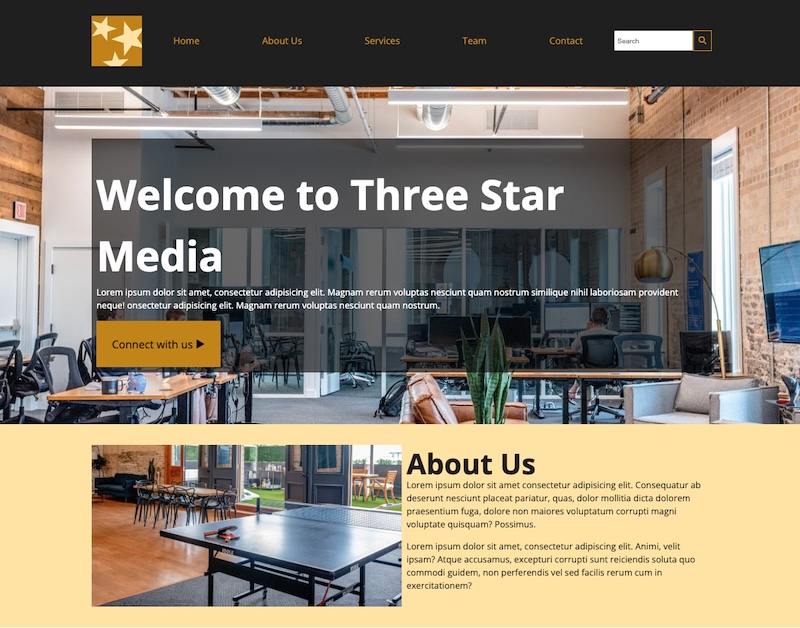
For the final project, I created a one-page website to practice structuring content with semantic HTML and styling it with CSS. I learned how to use CSS Grid and Flexbox for layout, and how to apply media queries to make the site responsive.
Tech Stack
- HTML
- CSS
Takeaways
Image Width
To make images responsive and fit their parent containers properly, the common CSS rule is:
img {
  max-width: 100%; /* makes the image shrink to fit within its parent element if it’s too large */
  height: auto; /* keeps the original aspect ratio */
  display: block; /* removes unwanted space below images */
}

img {
  width: 50%;
} /* set the image's width to 50% percent of its parent element's width */
Use max-width to limit container width
- When the viewport width is larger than max-width, the container will stop expanding and stay at that max width.
- When the viewport is smaller, the container will shrink accordingly.
@media screen and (min-width: 1200px) {
  .container {
    margin: 0 auto; /* centers the container when it’s narrower than the viewport */
    padding: 2em 6em;
    max-width: 1200px;
  }
}
Use Google font
- Copy the tag and paste it inside the of HTML file
- Apply the font in CSS:
body {
  font-family: "Roboto", sans-serif;
}
Input Width
To make input fields stretch to fill their container:
nav form input {
  width: 100%;
  padding-left: 5px;
}
What is SVG
SVG stands for Scalable Vector Graphic. It is perfect for buttons, icons, logos because:
- It scales without losing quality.
- You can change its color, size and hover effects using CSS or JS.
<form>
  <input type="search" name="search" id="search" placeholder="Search" />
  <button type="submit">
    <svg
      xmlns="http://www.w3.org/2000/svg"
      x="0px"
      y="0px"
      width="10"
      height="10"
      viewBox="0 0 48 48"
    >
      <path
        d="M 20.5 6 C 12.515556 6 6 12.515562 6 20.5 C 6 28.484438 12.515556 35 20.5 35 C 23.773158 35 26.788919 33.893018 29.220703 32.050781 L 38.585938 41.414062 A 2.0002 2.0002 0 1 0 41.414062 38.585938 L 32.050781 29.220703 C 33.893017 26.788918 35 23.773156 35 20.5 C 35 12.515562 28.484444 6 20.5 6 z M 20.5 10 C 26.322685 10 31 14.677319 31 20.5 C 31 23.295711 29.914065 25.820601 28.148438 27.697266 A 2.0002 2.0002 0 0 0 27.701172 28.144531 C 25.824103 29.912403 23.29771 31 20.5 31 C 14.677315 31 10 26.322681 10 20.5 C 10 14.677319 14.677315 10 20.5 10 z"
      ></path>
    </svg>
  </button>
</form>
em vs rem
-
em means element, it is relative to the font size of its parent. Useful for components that should scale together.
-
rem means root element, it is relative to the root font size. Good for consistent spacing and font sizes across a page.
html {
  font-size: 16px;
}

.container {
  font-size: 2em; /* 32px if parent is 16px */
  padding: 1em; /* 32px padding */
}

.title {
  font-size: 2rem; /* 32px no matter where it's used */
}
Using flex-grow
0 (default): item will not grow, 1: item can grow to fill available space.
nav ul {
  display: flex;
  flex-grow: 1; /* ul expands to fill available space in nav */
}

nav ul li {
  flex-grow: 1; /* each li will grow equally to fill available horizontal space */
}
CSS Flexbox
Flexbox is great for one-dimensional layout — items in a row OR a column.
- display: flex; Turns an element into a flex container
- flex-direction: Row (default) or column layout
- justify-content: Aligns items horizontally (main axis)
- align-items: Aligns items vertically (cross axis)
- gap: Adds spacing between items
- flex-grow: Allows items to grow and fill space
- flex-wrap: Wraps items to next line if they don’t fit
CSS Grid
Grid is designed for two-dimensional layouts — it lets you arrange items in rows and columns at the same time.
.services .grid-container {
  display: grid;
  /* the grid has 6 equal columns */
  grid-template-columns: repeat(6, 1fr);
  grid-gap: 10px;
}

.services h2 {
  /* takes columns 1 to 6 (1 row used)*/
  grid-column: 1 / span 6;
}

.services .group-service:nth-child(2) {
  /* takes columns 1 to 3 */
  grid-column: 1 / span 3;
}

.services .group-service:nth-child(3) {
  /* takes columns 4 to 6 (2 row used)*/
  grid-column: 4 / span 3;
}

.services .group-service:nth-child(4) {
  /* takes columns 1 to 2*/
  grid-column: 1 / span 2;
}

.services .group-service:nth-child(5) {
  /* takes columns 3 to 4*/
  grid-column: 3 / span 2;
}

.services .group-service:nth-child(6) {
  /* takes columns 5 to 6(3 row used)*/
  grid-column: 5 / span 2;
}
Reset CSS
Use reset.css to remove default browser styles, ensuring consistency across different browsers.
html,
body,
div,
span,
applet,
object,
iframe,
h1,
h2,
h3,
h4,
h5,
h6,
p,
blockquote,
pre,
a,
abbr,
acronym,
address,
big,
cite,
code,
del,
dfn,
em,
img,
ins,
kbd,
q,
s,
samp,
small,
strike,
strong,
sub,
sup,
tt,
var,
b,
u,
i,
center,
dl,
dt,
dd,
ol,
ul,
li,
fieldset,
form,
label,
legend,
table,
caption,
tbody,
tfoot,
thead,
tr,
th,
td,
article,
aside,
canvas,
details,
embed,
figure,
figcaption,
footer,
header,
hgroup,
menu,
nav,
output,
ruby,
section,
summary,
time,
mark,
audio,
video {
  margin: 0;
  padding: 0;
  border: 0;
  font-size: 100%;
  font: inherit;
  vertical-align: baseline;
}
/* HTML5 display-role reset for older browsers */
article,
aside,
details,
figcaption,
figure,
footer,
header,
hgroup,
menu,
nav,
section {
  display: block;
}
body {
  line-height: 1;
}
ol,
ul {
  list-style: none;
}
blockquote,
q {
  quotes: none;
}
blockquote:before,
blockquote:after,
q:before,
q:after {
  content: "";
  content: none;
}
table {
  border-collapse: collapse;
  border-spacing: 0;
}