Web2 Final: Readibo Website

Overview
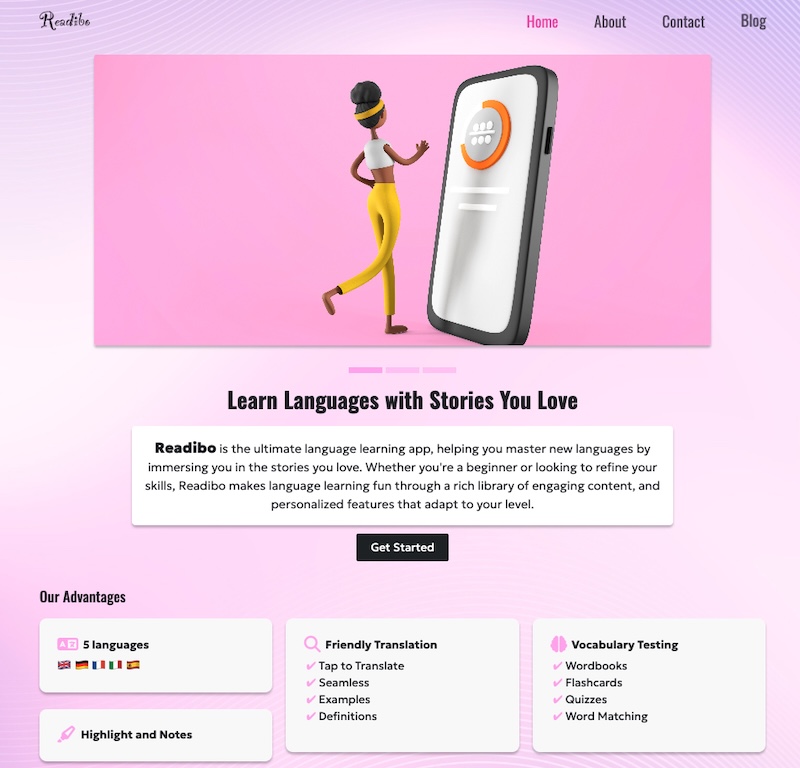
I used Bootstrap to build a product website for Readibo, a reading app I am currently developing. The app is designed to help users improve French vacabulary through reading ebooks.
This project taught me how to integrate Bootstrap with HTML, including using 'container' class for responsive layouts, 'row' class to structure content and various Bootstrap components to build a clean interface.
I aslo ran into a few chanllenges, especially related to accessibility. I worked on fixing low color contrast and ARIA issues. After makeing those improvements, WAVE reported no contrast erros, or alerts, and Lighthouse gave the site scores of over 90 in Performance, Accessibility, Best practices and SEO.
Tech Stack
- HTML
- CSS
- BootStrap
- Animate.css
Takeaways
Woth with Aria
aria-label
Add aria-label when an element doesn’t have clear, visible text to describe its purpose, especially for screen readers, like Icon-only buttons (any), logo link.
<ul class="nav flex-column">
  <li class="nav-item mb-2">
    <a href="https://www.instagram.com/" target="_blank" aria-label="Instagram">
      <i class="fa-brands fa-instagram fa-xl"></i>
    </a>
  </li>
  <li class="nav-item mb-2">
    <a
      href="https://learning.linkedin.com/"
      target="_blank"
      aria-label="Facebook"
    >
      <i class="fa-brands fa-linkedin fa-xl"></i>
    </a>
  </li>
</ul>
aria-labelledby
aria-labelledby works like aria-label, but it doesn’t need extra text — it reuses existing visible text from another element.
<section class="py-4" aria-labelledby="advantages-heading">
  <div class="container">
    <h2 id="advantages-heading" class="mb-4">Our Advantages</h2>
  </div>
</section>
aria-current
aria-current tells screen reader users which item in a set is currently active, like the current page in navigation.
<ul class="navbar-nav mb-lg-0 ms-auto mb-2 text-center">
  <li class="nav-item">
    <a class="nav-link active px-0" aria-current="page" href="index.html"
      >Home</a
    >
  </li>
  <li class="nav-item">
    <a class="nav-link px-0" href="about.html">About</a>
  </li>
  <li class="nav-item">
    <a class="nav-link px-0" href="contact.html">Contact</a>
  </li>
</ul>
aria-hidden
aria-hidden="true" tells screen readers to ignore the element — even if it’s visible on the screen, like decorative icons.
<div class="feature-box bottom-shadow">
  <div class="d-flex align-items-center mb-2">
    <i class="fa-solid fa-language fa-xl me-2" aria-hidden="true"></i>
    <strong>5 languages</strong>
  </div>
</div>
aria-controls
aria-controls tells screen readers that one element controls another element somewhere else on the page.
<button
  class="navbar-toggler"
  type="button"
  data-bs-toggle="collapse"
  aria-controls="navbarSupportedContent"
  aria-expanded="false"
  aria-label="Toggle navigation"
></button>
<div class="navbar-collapse collapse" id="navbarSupportedContent"></div>
Skip Link
A skip link is an accessibility feature that allows users to bypass repeated elements like navigation menus and jump directly to the main content of a webpage. when users press the Tab key, the browser shifts to the next focusable element - and a tag is focusable by default.
<a href="#main-content" class="skip-link">Skip to main content</a>
<main id="main-content">
  <!-- main content starts here -->
</main>
.skiplink {
position: absolute;
top: -40px;
left: 0;
}
.skiplink:focus {
top: 0;
background-color: var(--bs-primary);
color: #fff;
padding: 15px;
}.container and .container-fluid
.container: Provides a fixed-width layout that changes at different breakpoints. It's centered on the page using automatic left/right margin. Useful for standard pages with centered content.
.container-fluid: Uses 100% of the width of the screen at all sizes. It's good for full-width sections like banners, maps or headers.
.row
The .row class creates a horizontal group of columns inside a .container. It uses Flexbox to align .col elements horizontally.
<div class="container">
  <div class="row">
    <div class="col-sm-6 col-md-4"></div>
    <div class="col-sm-6 col-md-4"></div>
    <div class="col-sm-12 col-md-4"></div>
  </div>
</div>
Explanation: On small screens:
- col-sm-6: takes 50% width - 2 columns in one row
- col-sm12: takes 100% width - full width in next row
On medimun screens and up:
- col-md-4: each takes 1/3 of the row
Working with Flexbox
Bootstrap includes Flexbox utilities like d-flex to make layouts flexible.
<div class="d-flex flex-column text-shadow-1 h-100 p-4">
  <h3 class="display-6 lh-1 fw-bold mb-4 pt-3">Our Vision</h3>
  <p class="text-body-secondary">
    Readibo envisions a world where learning English is effortless and
    enjoyable. Through engaging stories and interactive tools, we empower users
    to build confidence, expand vocabulary, and develop a lifelong love for
    reading.
  </p>
</div>- d-flex: sets display: flex on an element
- flex-column: Stack items vertically
Responsive images with srcset and sizes
The browser uses sizes and srcset together to decide which image to load based on the viewport size.
<img
  src="./images/banner1.jpg"
  srcset="./images/banner1-s.jpg 600w, ./images/banner1.jpg 1200w"
  sizes="(max-width: 768px) 100vw, 1200px"
  class="rounded-1 bottom-shadow mb-4"
  alt="Readibo feature image"
/>-
Browser checks the screen width and matches the correct rule from sizes attribute. When the viewport is 768px or smaller, the image will be displayed at 100vw. If the screen is larger than 768px, the browser assumes the image will be shown at 1200px wide.
-
Browser picks the smallest image from srcset that is equal to or larger than the size found in Step 1. If size = 1000px → load banner1.jpg (1200w)
form-floating
The form-floating class creates a floating label effect where the label appears inside the input box by default and floats above it when the user types.
<form id="contact-form">
  <div class="form-floating mb-3">
    <input
      type="email"
      class="form-control"
      id="email"
      placeholder="Enter Email"
      required
    />
    <label for="email" class="form-label"> Enter Email </label>
  </div>
</form>
Customize Boostrap Style
To override Bootstrap styles, you can redefine Bootstrap CSS variables in your own CSS.
Example: change the active link color in the navbar and button styles.
.navbar {
  --bs-navbar-active-color: var(--bs-primary);
}
.btn-dark {
  --bs-btn-bg: var(--bs-primary);
  --bs-btn-border-color: var(--bs-primary);
  --bs-btn-hover-bg: var(--bs-primary);
  --bs-btn-hover-border-color: var(--bs-primary);
}
Animate.css
Animate.css is a simple CSS library that adds pre-built animations to HTML elements.
- add CDN in head
- add animate__animated + animation name to HTML element
- optional: use delay, duration, repeat classes
<li class="nav-item animate__animated animate__pulse animate__infinite">
  <a class="nav-link px-0" href="https://shermanliu.me/" target="_blank"
    >Blog</a
  >
</li>
Work with page background
Use ::before and z-index: -1 to create a layer behind the main content for a background without adding extral HTML.
body::before {
  content: ""; /* Required to make ::before render. It adds empty content. */
  position: fixed;
  top: 0;
  left: 0;
  width: 100%;
  height: 100%;
  background-image: url("../images/bg-s.jpg");
  background-size: cover;
  background-position: center;
  background-repeat: no-repeat;
  opacity: 0.8;
  z-index: -1;
}