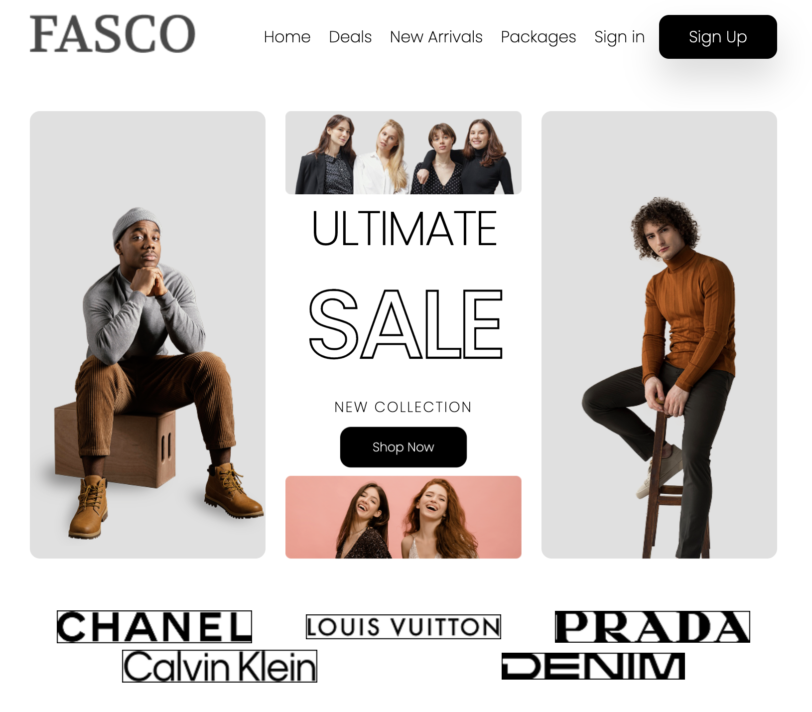
Web2 Midterm: Shopping Website

Overview
I used HTML and CSS to build a shopping website according a Figma file which provided by the assignment. But the file didn't include mobile design, so according to mobile design first principle, I had to figure out a mobile prototype before coding. During the coding process, I ran into some layout problems, like a shopping item card which contains images and several text info, which needed to be responsive in different sized screen. I also spent some time solving how to show different sized image in the hero part with the same size.

Tech Stack
- HTML
- CSS
Takeaways
flex: 1
In slide section, the left part contains an image, and the right side contains the slide information. The two parts take up the equal space and I used flex to achieve the layout.
- Use flex: 1 when you want equal distribution.
- Use flex: X values when you want proportional distribution.
- Don’t use it when items should just size themselves naturally.
<section class="slide-section" id="slide-section">
  <div class="slide">
    <div class="slide__image">
      <picture>
        <source srcset="images/slide-small.png" media="(max-width: 760px)" />
        <img src="images/slide.png" alt="Slide" />
      </picture>
    </div>
    <div class="slide__content">
      <p>Women Collection</p>
      <h2>Peaky Blinders</h2>
      <h3>DESCRIPTION</h3>
      <p>
        Lorem ipsum dolor sit amet, consectetur adipiscing elit. Scelerisque
        duis ultrices sollicitudin aliquam sem. Consectetur adipiscing elit.
        Scelerisque duis ultrices sollicitudin aliquam sem
      </p>
      <div class="slide__size">
        <p>Size: <span>M</span></p>
      </div>
      <div class="slide__price">
        <p><span>$100</span>.00</p>
      </div>
      <button>Buy Now</button>
    </div>
  </div>
</section>
.slide {
display: flex;
justify-content: center;
align-items: center;
}
.slide__image {
flex: 1;
}
.slide__content {
flex: 1;
background: #dadada;
display: flex;
flex-direction: column;
justify-content: space-between;
gap: 5px;
padding: 10px 20px;
}
.slide__content h2 {
font-family: "Volkhov", sans-serif;
font-size: 16px;
color: var(--secondary-black);
}
.slide__content h3 {
border-bottom: 1px solid #484848;
font-size: 14px;
}
.slide__content p {
font-size: 10px;
color: var(--secondary-grey);
}
.slide__content button {
font-size: 12px;
}
.slide__size span {
font-size: 12px;
background: var(--black-color);
border-radius: 8px;
color: var(--white-color);
padding: 0 15px;
margin-left: 10px;
}
.slide__price p {
font-size: 12px;
font-weight: 400;
color: var(--black-color);
}
.slide__price span {
font-size: 14px;
}Card Design
On the New Arrivals section of the index page, each product is displayed in a card layout containing an image, product name, brand, rating, reviews, and price.
I used Flexbox to make the layout responsive across different screen sizes.
<div class="arrival-cards">
  <div class="arrival-card">
    <!-- Product Image -->
    <img src="images/arrival.png" />

    <!-- Product Info -->
    <div class="arrival-card__info">
      <div class="arrival-card__header">
        <div>
          <p class="arrival-card__title">Shiny Dress</p>
          <p class="arrival-card__brand">AI Karam</p>
        </div>
        <div class="arrival-card__rating">★★★★★</div>
      </div>

      <!-- Reviews -->
      <p class="arrival-card__reviews">(4.1k) Customer Reviews</p>

      <!-- Price + Stock -->
      <div class="arrival-card__footer">
        <p class="arrival-card__price">$95.50</p>
        <p class="arrival-card__stock">Almost Sold Out</p>
      </div>
    </div>
  </div>
</div>
.arrival-cards {
display: flex;
flex-wrap: wrap;
justify-content: center;
align-items: center;
margin: 30px auto;
}
.arrival-card {
padding: 5px 10px 15px 10px;
background-color: var(--white-color);
border-radius: 10px;
}
.arrival-card__info {
display: flex;
flex-direction: column;
gap: 10px;
}
.arrival-card__header {
display: flex;
justify-content: space-between;
}
.arrival-card__title {
font-weight: bold;
font-size: 18px;
color: var(--secondary-black);
}
.arrival-card__brand {
font-size: 16px;
color: var(--grey-color);
line-height: 1.2;
}
.arrival-card__rating span {
color: var(--yellow);
font-size: 20px;
}
.arrival-card__reviews {
font-weight: 400;
font-size: 12px;
}
.arrival-card__footer {
display: flex;
justify-content: space-between;
align-items: center;
}
.product-card__price {
font-size: 24px;
font-weight: 400;
}
.product-card__stock {
color: var(--red);
font-size: 12px;
line-height: 2;
letter-spacing: 0.01em;
}CSS Animations
CSS animations allow you to change an element's style over a set duration. This is done by pairing the animation property with a set of @keyframes.
Defining Keyframes
The @keyframes at-rule defines the stages of an animation. You can specify styles at different points in the animation's timeline using percentages (from 0% to 100%) or the keywords from (same as 0%) and to (same as 100%).
Here are two examples from this project:
-
A
popanimation that scales an element up and down:@keyframes pop { 0%, 100% { transform: scale(1); } 50% { transform: scale(1.1); } } -
A
fadeInanimation that makes an element appear and move up:@keyframes fadeIn { from { opacity: 0; transform: translateY(20px); } to { opacity: 1; transform: translateY(0); } }
Applying Animations
You apply an animation to an element using the animation shorthand property. This property combines several animation-related properties into one declaration.
Let's see an example: animation: pop 1.5s ease-in-out infinite alternate;
- pop: The
animation-name, which must match the name of a@keyframesrule. - 1.5s: The
animation-duration, defining how long one cycle of the animation takes. - ease-in-out: The
animation-timing-function, which controls the speed curve of the animation.ease-in-outmeans the animation starts slowly, speeds up in the middle, and then slows down at the end. - infinite: The
animation-iteration-count, specifying how many times the animation should repeat.infinitemeans it will loop forever. You can also use a number like3. - alternate: The
animation-direction. When set, the animation plays forwards on odd-numbered cycles (1st, 3rd, etc.) and backwards on even-numbered cycles (2nd, 4th, etc.).
Add font
I can use @font-face to load a custom font when I have a font file without accessing Google Fonts or a CDN, useage:
@font-face {
  font-family: "Digital Numbers Regular";
  font-style: normal;
  font-weight: normal;
  src:
    local("Digital Numbers Regular"),
    url("../fonts/DigitalNumbers-Regular.woff") format("woff");
}

@font-face {
  font-family: "Digital Numbers Regular";
  src: url("Digital Numbers Regular.woff2") format("woff2");
  font-weight: 700;
  font-style: normal;
}

p {
  font-family: "Poppins", sans-serif;
  font-weight: bold; /* Browser tries to find a matching @font-face with a font-weight of 700 */
}
Work with Picture
'picture' element allows to show different images based on the screen size.
<picture>
  <!-- For very small screens -->
  <source srcset="images/FASCO-small.png" media="(max-width: 480px)" />
  <!-- For screens 760px wide or smaller, the browser loads images/FASCO-small.png -->
  <source srcset="images/FASCO-medium.png" media="(max-width: 760px)" />
  <!-- For screens larger than 760px, the browser loads images/FASCO.png -->
  <img src="images/FASCO.png" alt="FASCO Logo" />
</picture>